Wednesday, November 18, 2015

Let's Get Ready to Rumble!

In the Colosseum! 

Welcome warrior. It is time to show your worth and reap bragging rights here in the Colosseum.

If you wish to prove that you are the best warrior in the land, then slay these beasts and rank higher than your fellow warriors.

Be warned, these monsters will learn over time and become much more difficult to fight.

Colosseum in Maya.

Hey guys! Updating once again. 
Things have been rather busy, and today I am posting some concepts (and hopefully soon a video) of the most recent Rapid Prototype Android Tablet game, Colosseum. Man that was a mouth full. 
Anyway, in the Colosseum you play on an Android Tablet, or phone if you prefer, and you must slay a variety of monsters. Surviving for as long as you can to rank continue to increase your score. However, the rounds get harder over time and you only have two ways of attacking: Melee with your sword, or Ranged/Pierce with your arrow.
You also must be wary that you will be attacked at all sides. Yes, this game simulated Virtual Reality and you must rotate your phone all around you in order to see the monsters from all angles. Though, you can also restrict that turn on the opening screen by unselecting the 360 button which will move it to a standard 180 rotation. 
 Now, I probably made that sound confusing. Essentially this game is a virtual reality game and your phone/tablet is your "occulus rift" so to speak. You must look around the Colosseum to know where the monsters are attack and either tap (arrow) or swipe (sword) to attack the on coming monsters.

Bellow are just some of the monsters we had. These are the ones I designed and animated for the game.
Crisophynx. Flying opponent. Quick and hard to hit. 
Ki-Rin. Speed Opponent. Low Damage but rapidly approaches player.
Manticore. Power Opponent. High Damage, slow movement.
This game was loads of fun to work on! First RPP also that I got to make enemies. Woot! 
I enjoy drawing monsters and making them a real threat in a game, hence why I enjoy anything that is considered a bad guy  in most forms of entertainment. lol 

Next RPP prototype is Scales of Truth (Jasmine and my pitch for capstone). I'm really looking forward to this one, and so excited to work on this game. Hopefully Scales get's to move on to being a Capstone game

I'm Back! Revamped!

The madness never ends!
       I'm not. Alone.
        This time I brought some friends!
Not the most friendly bunch, are they?

Hey guys! Still been pretty quiet when it comes to posting, but so very soon I shall be changing that~
Not that it is way past over, I shall be showing off the Pirate Fish Guy here for all to see. Yay. 

First up: 

    The Low Poly Mesh.


Even though this project went for about a month of work for one character, and there was obviously some parts that was very annoying to work with, but all and all it was fun.

UV Mapping

Of course, not all of it was fun and games. Uv mapping for certain areas was pretty difficult. Strange enough ,it wasn't even the pieces others have told me would be the most difficult. The hand and head did not take long. But I had more trouble with the belt and buckles more than anything else. Things didn't go as smoothly all throughout as I would like, but it was a good experience regardless. 

UV Mapping; clean.


UV Mapping. Test.

As fun as UVing was, my favorite part was actually the sculpting. Messing around with ZBrush to get that right texture was great. I got to bring the character alive and that was one of the best parts I got to work on. Though, I think I got a little too happy with making him closer to reality than making him a more cartoonish representation that was shown in the original concept art. But then again, he did say to go nuts and have fun, so to speak. So, I made him more towards what I like to do while also experimenting. Now that was fun.


 ZBrush Turnaround Video.

I think he came out really nicely. It also didn't take me as long to do it as I thought it would. Which is surprising to say the least.

I think the one part that was the most annoying was the Bake Mapping. Originally, I mapped using Maya. Usually it works just fine, but for this guy, it never came out right. Black spots everywhere, details that was so strong on the sculpt never showed on the low poly mesh. It was annoying. Because of this, I had to find another way to do it. It was suggested to me to use the program xNormals in order to get a cleaner bake. Unfortunately that wasn't the case.

But then, Substance Painter came into the lineup. I was told that Substance Painter also does bake mapping and it is extremely accurate so long as the UVs are alright. Skeptical about it, I tried it anyway and was ecstatic with the result. The end result created a clean bake along with an ambient occlusion map (something I really dislike doing through Maya) to accurately obtain that look I wanted.


          Normal Map.                                                                    Ambient Occlusion Map. 


It was neat! I loved the fact that it just smoothly transferred onto my low poly mesh and just looked like the high poly one without that strange blackness occurring. Because of that, I wondered why I wasn't using it earlier. It cuts down so much time, especially with painting. The choice of painting on the Sculpt or the UV's themselves? Madness! Though it works so well.


Substance Painter; 3D and UV painting mode. 

Doesn't he look great? Next would be to show you all how he looks like in the world I created a while ago. Though, I think I shall wait to do that after I rig him for Common Core. Maybe that will go quite well, or well, hopefully that will go very well. Would love to see this guy waddle around with his short legs. 8D

Tuesday, November 10, 2015

Aim the Scope for the Kill

It's an overkill!
Hey guys, long time no post. Things have been pretty busy here on FIEA, and for good reason. So much to learn and do with so little time, it's a wonder how things get done with how much sleep I like to get. xD
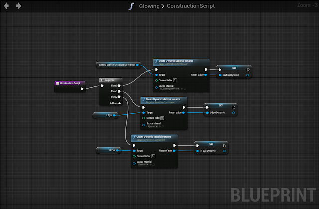
Jokes aside, this time around I am showing you wonderful people some horrible artsy coding in UE4!  

Nothing all that nice really. Kinda Technical Artist type deal and what not. But I think I kinda understand it.

There's two different interactions that are going on, as shown on the video. The Bounding Box is one of the triggers where the player heads towards the opponent, in this case the starfish creature, for something to happen. In this case, the color changed into two contrasting spectrum: White and Black.  I originally wanted to get the mesh to change many different colors when you go in and out of the box, but I couldn't figure out exactly how to do that. So I settled with the two different color, as shown.

The second trigger was a Key Trigger. Unable to get the other keys to read, I settled with pressing the G Key to make things happen. In this case, was getting the eyes to glow in and out, as what we did in class. Kinda wanted some other effects to happen, but the other keys would not trigger/read so I scrapped that idea and when simple.


Look how neat and pretty this is. xD 


Though, of course, this is probably one of the more difficult assignments I had to mess with. When I get the chance, I shall record/screen capture my other assignments to showcase here. But for now, everyone can enjoy some music and quickly placed together render of the test file. 


For now, I shall go and work on some more homework.. x-x
Couldn't say it better myself, Spidey.